You may still be waiting for your Nexus 5 order to ship, but Google was nice enough to deliver a unit to our offices early Friday morning. While I plan to put the Nexus 5 through its paces for our official review, I thought I’d share some of my initial thoughts after spending just a few hours with the handset. The Nexus 5 is quite impressive, both in terms of hardware and software, but there are a few aspects of the phone that give me pause and keep me from falling completely in love with it.
Not too plasticky
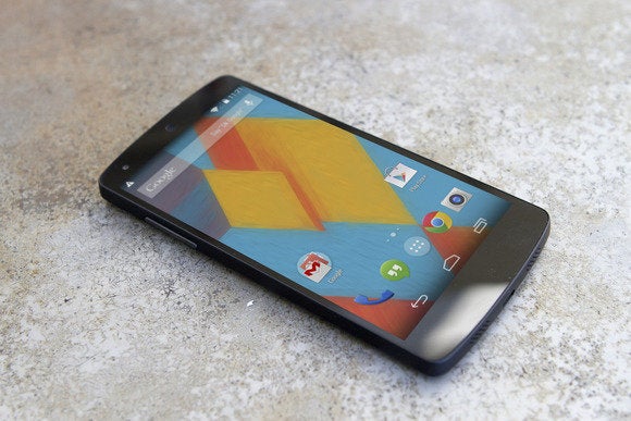
 IMAGE: Michael HomnickThe Nexus 5
The Nexus 5 is roughly the same size as the Samsung Galaxy S4, but it’s not as plasticky and it feels a lot more boxy than Samsung’s flagship Android phone. A colleague described the Nexus 5 as being, “plastic, yet not unapologetically plastic like the iPhone 5c” and I kind of understood his point: The Nexus 5 doesn’t feel cheap but it also lacks the premium feel you get from phones like the iPhone 5s or HTC One. The soft rubbery coating on the back of the Nexus 5 does gather fingerprints, but you can easily wipe them off with a tissue or cloth.
The 5-inch 1080p display on the Nexus 5 looks sharp and definitely feels like a step up from the 1280-by-768-pixel display on the Nexus 4, but the phone’s square corners make it a bit difficult to reach the top most edges of the screen without readjusting your grip. The protruding camera lens on the back of the phone prevents it from resting flat on a table and I’m worried that it’ll be extremely easy to damage. Unless you’re always putting the phone screen down, I fear it’s only a matter of time before your Nexus 5 has a nice big scratch on its lens.
 IMAGE: Michael HomnickThe Nexus 5's large lens may just be its biggest design fault.
KitKat is pretty tasty
Of course the Nexus 5 just wouldn’t be a Nexus if it wasn’t running the latest version of Google’s mobile OS. Although its version number may suggest that it’s just a minor update, Android 4.4 KitKat actually has a surprising number of goodies and improvements that make it feel significantly different to Android 4.3 Jelly Bean. The interface feels snappier, the animations look smoother, and phone as a whole feels more like a Google phone.
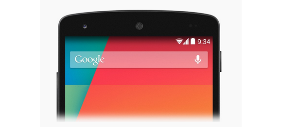
The interface changes extend throughout the OS, but are most noticeable on the home screen and in the app drawer. There’s a persistent Google search bar at the top of every home screen that you can voice activate by saying “OK Google,” and Google Now has been given its own home screen pane for even easier access. The app drawer ditches the dark aesthetics that were introduced in Android 4.0 Ice Cream Sandwich and appears to have relocated widgets off to their own little corner of the OS.
 IMAGE: GoogleThe Google search bar on the home screen has been tweaked slightly.
Even as someone who’s used Android since the very beginning, I couldn’t help but feel overwhelmed as I poked my way around the OS. There’s a lot to take in, and I have a feeling people (who don’t read change logs or have already taken apart the KitKat AOSP image) will still be finding surprises for several months after KitKat makes its way out to the general public. In many ways KitKat is the defining feature of the Nexus 5, as the phone itself feels very run of the mill. It’s very nice hardware for the price, but you could throw it in a lineup with a bunch of other black Android phones and not notice much of a difference.
Be sure to check back early next week for our review of the Nexus 5 and my final thoughts on the phone.
Subscribe to the Smartphone News Newsletter
Thank you for sharing this page.
Sorry! There was an error emailing this page
Category: jordy nelson Mary Queen of Scots Common App broncos powerball winning numbers
No comments:
Post a Comment
Note: Only a member of this blog may post a comment.